Visualizing Data
In this tutorial we will go over some of the finer points of using the
visualize() method
of the DataSet class. For all
of these examples we will use the GSE73072 dataset, as it contains enough
complexity to demostrate the utitlity of the method, see the
What is the DataSet class? tutorial for
details on how to access this dataset. First we load the dataset:
>>> # imports
>>> import os
>>> from orthrus.core.dataset import load_dataset

>>> # load the data
>>> file_path = os.path.join(os.environ["ORTHRUS_PATH"],
...                          "test_data/GSE73072/Data/GSE73072.ds")
>>> ds = load_dataset(file_path)
Basic Usage
One can easily start plotting their data without any in-depth knowledge of the method. In this example we will
plot the GSE73072 data in 2D using Multi-dimensional Scaling and coloring
the plot by the virus attribute:
>>> # imports
>>> from orthrus.manifold.mds import MDS

>>> # visualize the data with MDS
>>> mds = MDS(n_components=2)
>>> ds.visualize(embedding=mds,
...              attr='virus'.
...              alpha=.8)
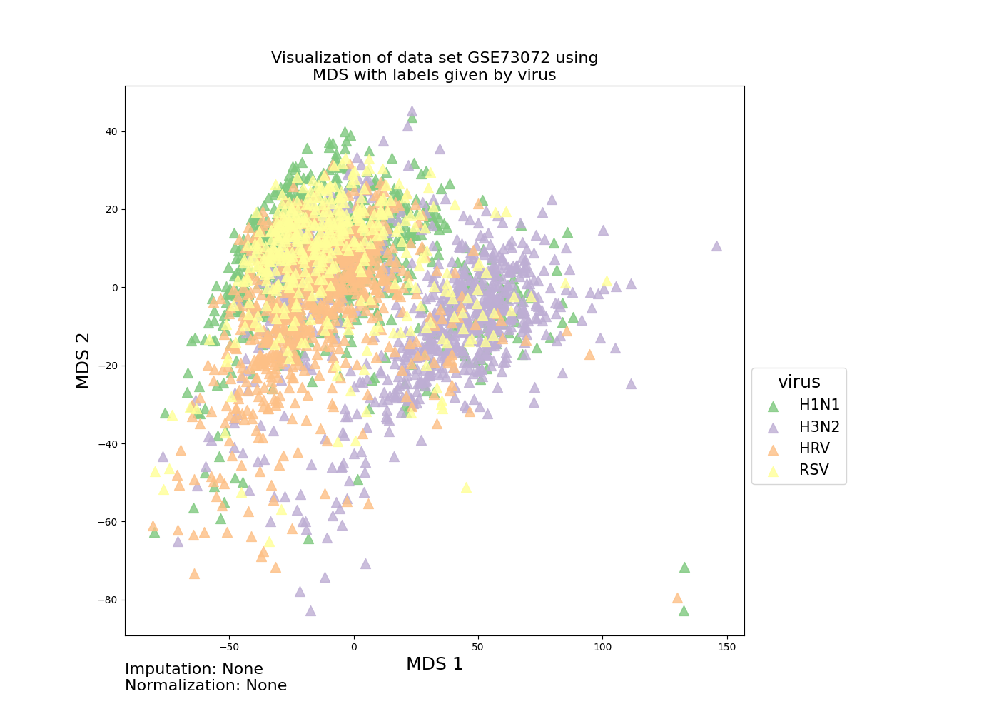
The alpha parameter here denotes the transparency of the markers, and is useful when there
is overlap of the colored classes.
Customizing Plots
By default the visualize()
method uses Pyplot as a backend and the
seaborn palettes for coloring. For example we can
specify palette='bright' and mrkr_list=['o'] to use the bright seaborn color palette and circle Pyplot
markers:
>>> # plot with bright palette and circle markers
>>> ds.visualize(embedding=mds,
...              palette='bright',
...              mrkr_list=['o'],
...              alpha=.8,
...              attr='virus')
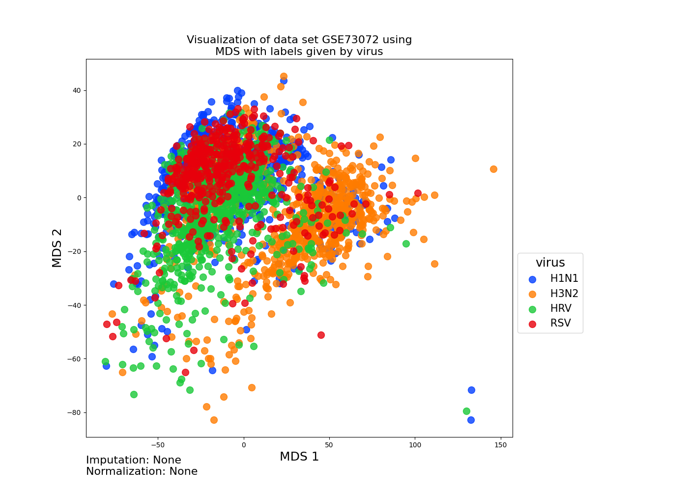
In fact any keyword arguments that can be passed to
matplotlib.axes.Axes.update() (dim=2) and
mpl_toolkits.mplot3d.axes3d.Axes3D.update() (dim=3) can also be
passed to the visualize() method. This allows for a great deal of plot customization in the case that
the default arguments are not sufficient. Here is an example where we restrict the samples to only H1N1 and H3N2 virus types via the keyword argument sample_ids, color the samples by time point in hours,
use different markers for virus types via the cross_attr argument, and embed into 3D rather than 2D via the dim argument:
>>> # restrict the samples to H1N1 and H3N2
>>> sample_ids = ds.metadata['virus'].isin(['H1N1', 'H3N2'])

>>> # represent time_point_hr as a continuous variable
>>> ds.metadata['time_point_hr'] = ds.metadata['time_point_hr'].astype(float)

>>> # visualize the data with MDS in 3D
>>> mds = MDS(n_components=3)
>>> ds.visualize(embedding=mds,
...              sample_ids=sample_ids,
...              attr='time_point_hr',
...              cross_attr='virus',
...              palette="magma",
...              subtitle='')
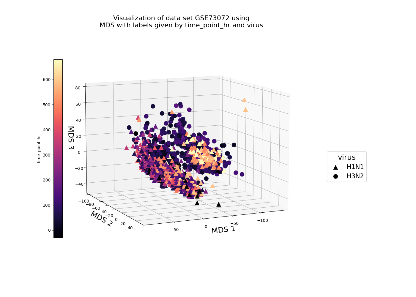
Similarly we can restrict the features to use in the visualization by specifying the feature_ids keyword argument.
Saving Plots
In order to save a plot, one can specify save=True in the visualize() method. By default
plots will save to the DataSet.path directory and with the name DataSet.name _ viz_name _ DataSet.imputation_method _ DataSet.normalization_method _ attr _ cross_attr _ dim
with the appropriate extension. Alternatively one can specify the keyword argument save_name without an extension, e.g., save_name=gse73072_mds_dim3.
Using Plotly
The orthrus package uses two backends for plotting, Pyplot
and Plotly. Pyplot is ideal for generating non-interative plots, such as
figures to be included in a document, while Plotly is ideal for generating interactive plots which can be exported as .html
or hosted on server with use of dash. We provide a few examples below to demonstrate the Plotly
backend. Here is one where export the interative plotly figure to an .html file:
>>> # set figure directory
>>> ds.path = os.path.join(os.environ["ORTHRUS_PATH"],
...                        "docsrc/figures")

>>> # visualize data using plotly
>>> mds = MDS(n_components=3)
>>> ds.visualize(embedding=mds,
...         backend='plotly',
...         attr='virus',
...         save=True,
...         save_name='gse73073_mds_viz_example_4_3d',
...         figsize=(1500, 1000),
...         opacity=.7,
...         mrkr_size=5,
...         subtitle='')
Click to view output: gse73073_mds_viz_example_4_3d.html.
Dash
Just like with Pyplot the user can
specify any keyword arguments used in Plotly’s scatter function
to customize their plots further. In addition the user can also host their figures on a server, by specify the keyword argument use_dash=True,
and configure the server settings by specifying any keyword arguments used in Plotly Dash’s run_server method.
Here is an example where we host our figure on localhost:5000:
>>> # host figure on localhost:5000
>>> mds = MDS(n_components=2)
>>> ds.visualize(embedding=mds,
...             backend='plotly',
...             attr='virus',
...             use_dash=True,
...             host='127.0.0.1',
...             port='5000')

Dash is running on http://127.0.0.1:5000/
* Serving Flask app "orthrus.core.helper" (lazy loading)
* Environment: production
  WARNING: This is a development server. Do not use it in a production deployment.
  Use a production WSGI server instead.
* Debug mode: off
* Running on http://127.0.0.1:5000/ (Press CTRL+C to quit)